Introducing scopes
Ubuntu’s scopes give you related content on one screen, instead of hiding it behind different apps. So everything you look for in life is now right at your fingertips.
What is a scope?
Scopes use a straightforward framework for containing data sources where they deliver content by topic, straight to the user’s fingertips.
How they work
-
They retrieve search results from single or multiple sources.
-
They group elements together in categories and pre-defined cards to create home screens with related content.
-
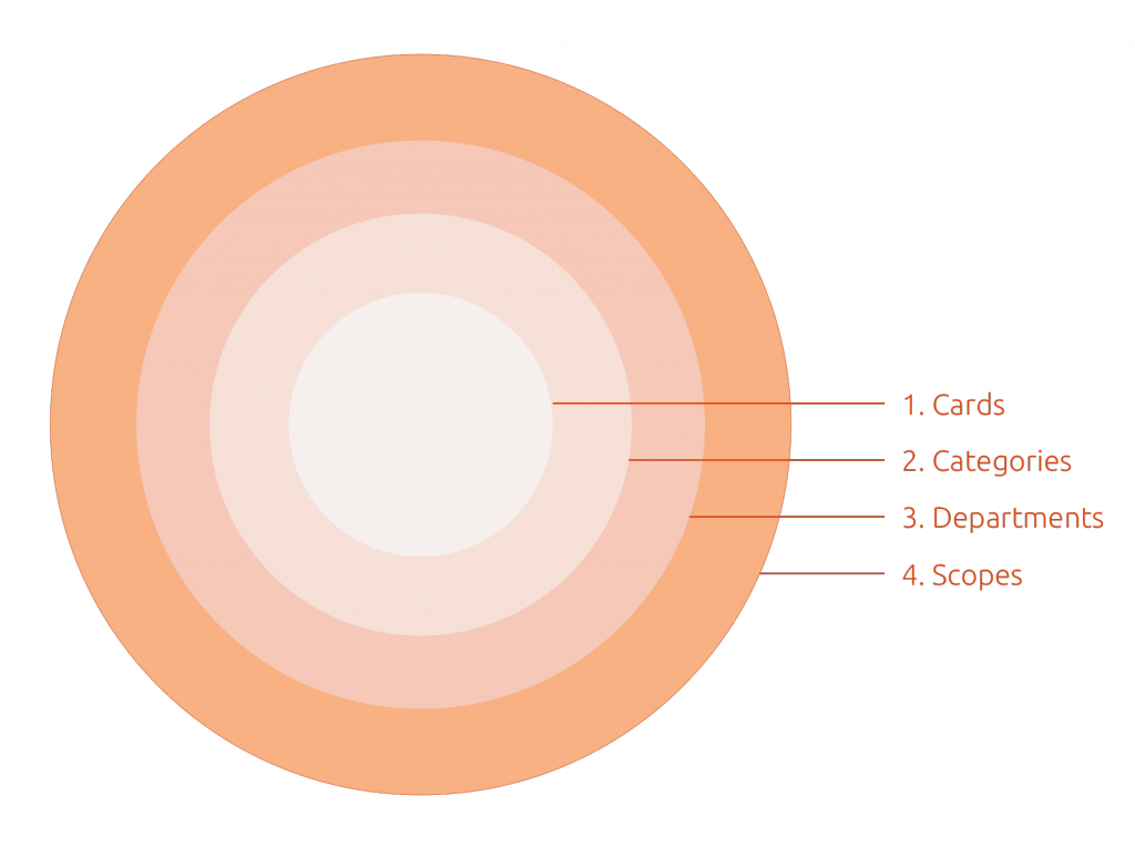
Cards – It all starts with a result, which can be made up of a maximum of three components to create a concise visual package.
-
Categories – Here related cards (results) are grouped together to form categories.
-
Departments – This is an optional filter that can be used to filter results into different groups and give the user a more targeted search.
-
Scopes – This is the container that holds all the related cards and categories together inside a concise and visually pleasing home screen.

An aggregator scope displays data from multiple sources as opposed to a normal scope, branded or unbranded, which displays data from a single source.
The benefit of Scopes
Scopes allow you to deliver a new mobile experience where content is more accessible and customizable.
All in one place
Unlike an app where you have to delve into each for specific content, scopes surface related content and services all in one place.

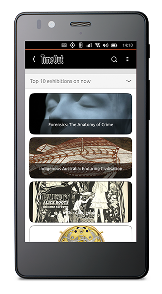
Preview content
Let users touch, look inside and preview content they are interested in with minimum effort.
Take action
Allow users to purchase music, products, connect to websites, view map locations as well as various other ‘calls to action’.
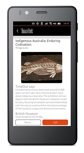

Implement the widget, meta data and query bases for previews from our SDK.
Easy to create
Scopes are easy to create, there are pre-defined layouts and card designs that you can piece together, in multiple ways, to create your very own scope design.
Cards
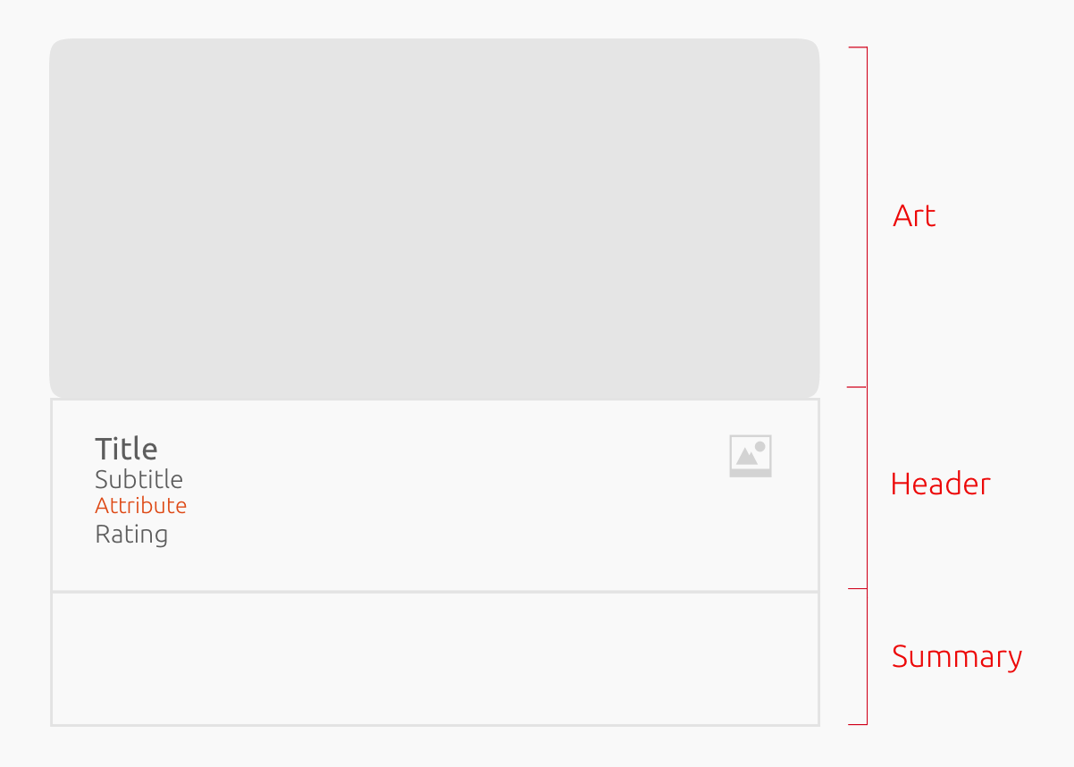
Cards represent a search result and can be made up of three components, which can be arranged to suit the content displayed.
-
Art
-
Header
-
Summary

See our Components section for the different ways you can place components in cards, as well as card sizes and layouts.
Categories
Categories group together related results and help you structure your scope to suit the content being displayed.

Grid

Horizontal lists
-
Category layout: Grid (default), horizontal list
-
Card layout: Vertical (default) or horizontal.
-
Card size: Small, medium (default), large.
-
Header overlay: Where the header can overlay the art (image).
-
Collapsed rows: Number of result rows displayed while the category is collapsed.
-
Card-background: Change the background color for cards.

To see examples of a standard template code and more in-depth information see our developer docs.

See our Components section for the different ways you can place components in cards, as well as card sizes and layouts.
Modes of display
Scopes have two modes of displaying content.
Surface mode
When the user has not requested a specific search query, the scope will display a set of results that might have relevance to the user e.g. weather.

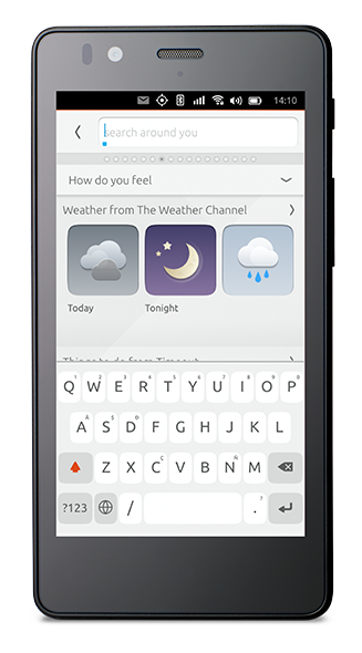
Search mode
The scope header turns into an input query string when the user searches for a specific piece of content.
Results page
The scope will search across all its data sources and render results according to the search query.


As the scope author, you can choose how to layout your category structure and use appropriate filters to best show content results.
Scope types
There are two types of scopes: aggregators and branded (or single source).
Aggregator scopes
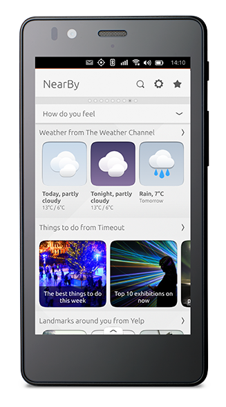
Aggregator scopes are installed by default and are one of the key benefits that a scope experience entails. Aggregator scopes are designed to collect content and services from different sources to create new, differentiating experiences on Ubuntu. The NearBy scope is a perfect example of this.
Branded scopes
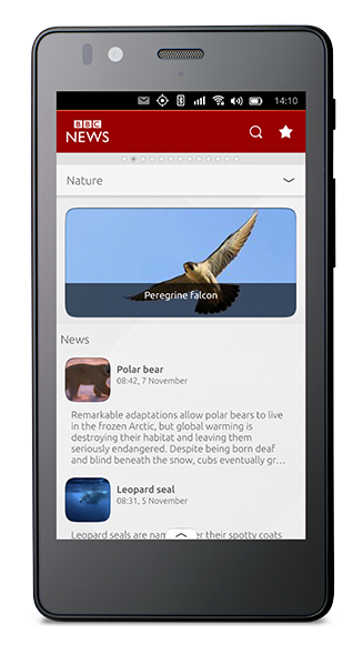
Branded scopes present content from a single source. For instance, BBC News will only display stories sourced from the BBC and Time out will show you events from their service only. Using the scope toolkit allows the content provider to stamp their brand and character on the scope.
Launch scopes
There are a range of aggregator scopes pre-installed on an Ubuntu device. Here are a handful to take inspiration from:

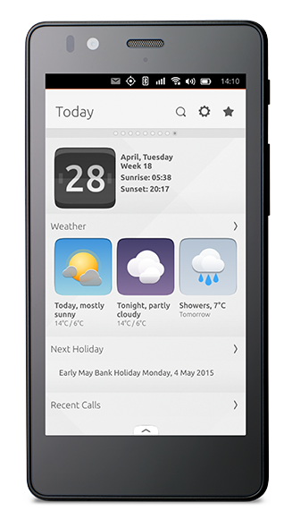
Today
Contains the user’s events, tasks, messages, as well as news, weather and more.
Sources:
-
Weather Channel
-
News sources
-
Fitbit activity
-
Other local sources
NearBy
Contains local services from around the user’s area.
Sources:
-
Yelp
-
TimeOut
-
Inrix
-
Open street maps
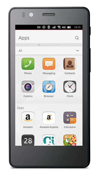
Apps
Shows all apps installed on your device in alphabetical order.
Sources:
-
All apps
-
Ubuntu Store
Start designing
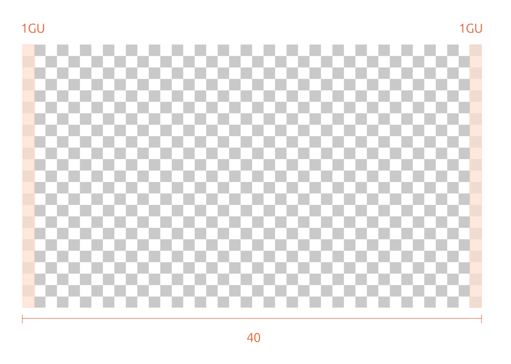
As we want people to create a consistent look across different screen-sizes and resolutions, we have defined a set amount of grid: 40 (phone), 50 (phone, tablet) 90 (desktop, larger screens).
Available:
-
40 GU – phone size
-
50 GU – phone, tablet
-
90 GU – desktop, larger screens
The grid unit defines a visual rhythm in Ubuntu and should be used for all measurements: sizes of elements, spacing, margins, etc. should all use multiples of 1 GU (Grid Unit).
A benefit of using grid units instead of pixels is that it gives the designer more of a visualization of how much space they have to work with, together with sizing and positioning elements more specifically.

Once you have written your fantastic new scope, you will have to name it. Use keywords to help your scope get noticed.

Travel through some of our core scopes for inspiration.
The tools
At a fraction of the cost of building an app, the scope toolkit allows you to give the user more than just an RSS feed, but a whole new user experience of consuming and surfacing content.

Raring to go? Then dive into our Scope Toolkit(SDK)(SDK) for all our APIs.
 Ubuntu Phone documentation