Bottom edge
Create something special with a unique bottom edge that belongs to your app from the bottom of the screen.
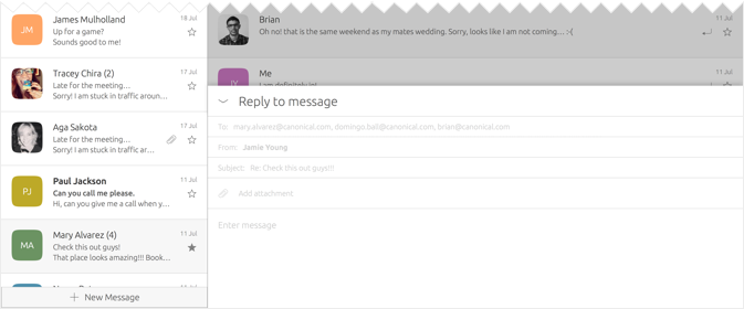
Quick access to new content
 |
The BottomEdge API provides bottom edge content handling. See also the BottomEdgeHint API, which displays a label or an icon, or both, at the bottom of the component it is attached to. |
|---|
Overview
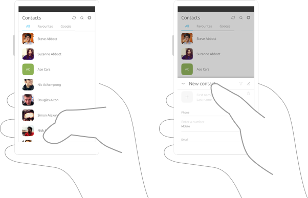
The bottom edge allows for a very natural transition through a progressive gesture from the bottom of the screen. The gesture should take logical steps to reach a point of interest for the user. It can provide access to a view via page stack, important actions, or access to app settings and features.
 |
You can create your own customised bottom edge and add different content depending on the context of your app. See ‘Loving the bottom edge’ for more information. |
|---|
Use cases
The bottom edge can be used to give access to the most important features inside your app.
Is your app often used to create new content?
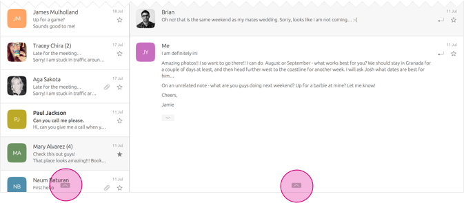
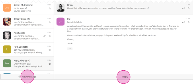
Use the bottom edge to quickly create or draft new content, such as composing a new email or text message.

Does your app need access to a commonly used feature that needs a separate view?
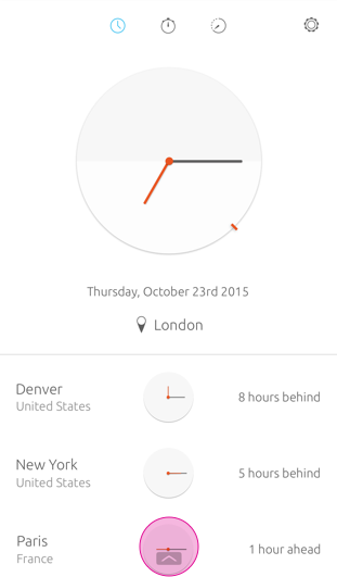
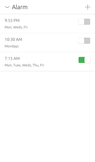
Use the bottom edge to give the user quick access to an app setting or feature, such as setting a new alarm in the Clock app.
Does your app allow the user to add information in a form?
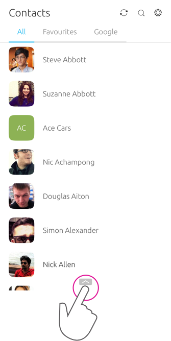
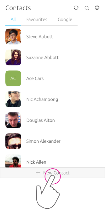
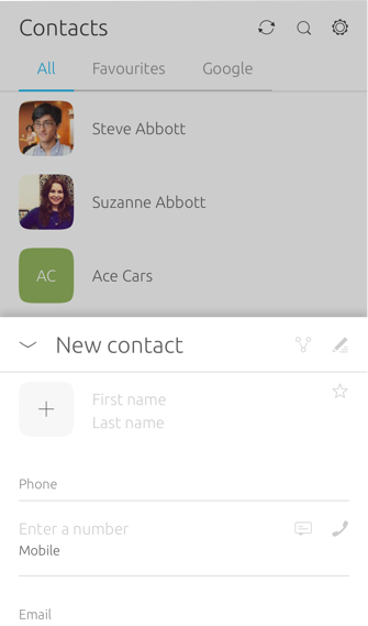
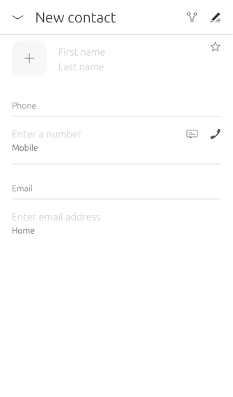
Use the bottom edge to provide quick access to a form, such as adding a new contact or creating a new account.
Does your app allow users to access more views?
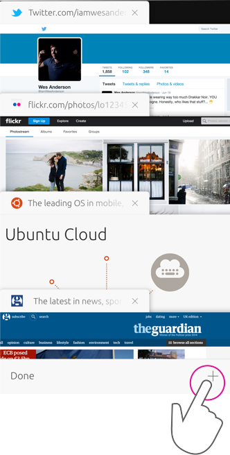
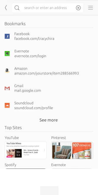
You can use the bottom edge to reveal all views or tabs currently open to allows the user to switch between them easily and quickly. For example, the bottom edge in the Browser app reveals all the open tabs the user has open.
Hints
The toolkit provides a hint that consists of two elements: Hint 1 and Hint 2. The hint is used to let the user know that there is something worth trying at the bottom of the screen.
Hint 1

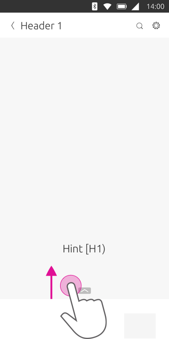
When your application is launched for the first time, the user will see a floating icon, known as Hint 1.
Hint 2

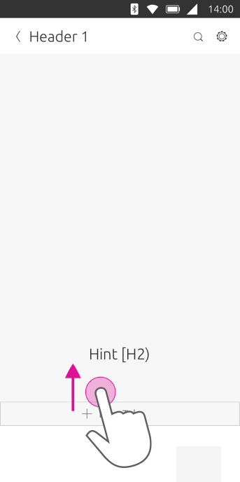
After the user has interacted with Hint 1, the hint will morph to become Hint 2, which contains a label, icon or a combination of the two. Using a label with an icon gives the user more detail of the content it will show.
Hint labels
It is important that your hint label is concise and clear to avoid confusing the user.

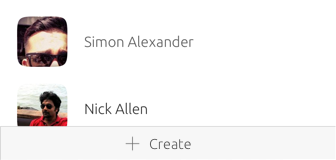

Do

Don’t
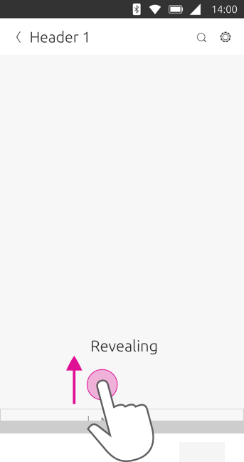
Step 1. Unfolding hint
Hint 1 is visible when the user first interacts with your app. By short swiping from Hint 1; Hint 2 starts to replace Hint 1 which then becomes fully visible.
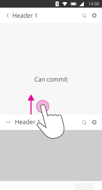
Step 2. Collapsing
Hint 2 is now fully visible; however if the user doesn’t interact with the content or screen for a period time, then Hint 1 it will automatically fade in and replace Hint 2.

Hiding the hint
You can choose to have the bottom edge hint hidden from view when the user scrolls the content on the screen. This would work well for apps that need the whole screen, such as the Camera app, because the primary goal is to take a picture.

 Ubuntu Phone documentation