Core scopes
Take inspiration from how we have structured and designed some of our core scopes.
Favoriting
The user can choose the scopes they would like to appear on swipe from the App scope (default) by favoriting or unfavoriting.
Manage screen
The user can swipe up from the Bottom Edge to manage their installed scopes. The hint appears at the bottom of every scope page.
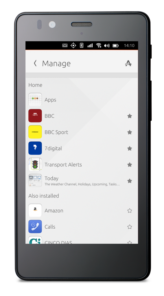
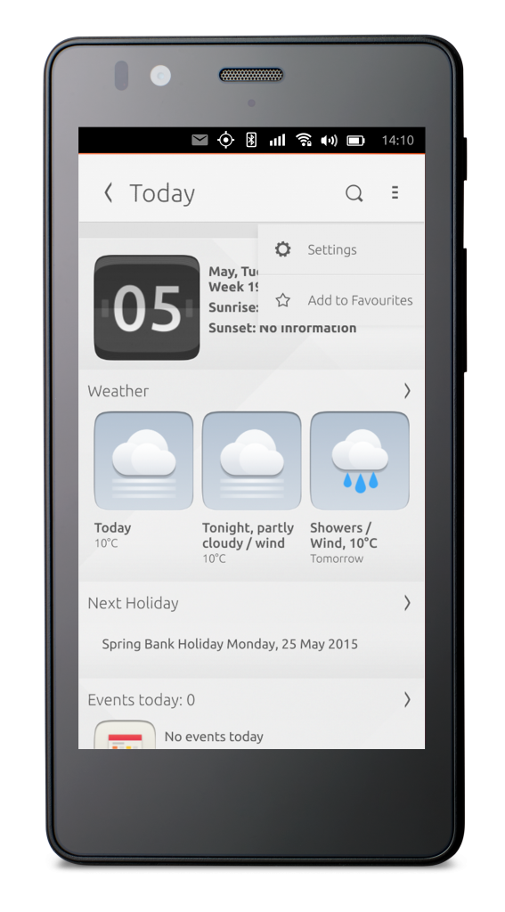
Unfavorited scope
When unfavorited the whole scope fades away and the scope next on the right appears, where the pagination dots are corrected.
Favorited scope
Once favorited, the star on the right hand side of the scope header is filled, and the scope appears when the user swipes right from the App scope.
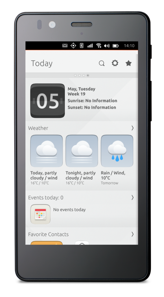

The user is always able to remove all scopes (except the Apps scope), regardless of the initial scope configuration chosen by the operator.
Navigation
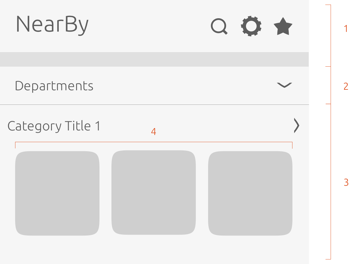
There are a number of ways to navigate to different views inside a scope.
-
Scope header – contains the title of your scope and optional icons that can take action or navigate to a different screen.
-
Department drop-down – is an optional feature to give the user a more targeted and narrower search.
-
Category header link – Can be placed in the header of a category to lead the user to a connected child scope.
-
Tap card to preview content – tapping on a card can take the user to a preview screen, where they can take action e.g. ‘Play’ or ‘Open’.

See more in our Navigation section on how to get the best navigation experience within your scope.
Enabling content
From the settings icon in the scope header, users can enable their geographical location to enable local data, switch certain data feeds on or off, or choose a configuration.
No data sourced
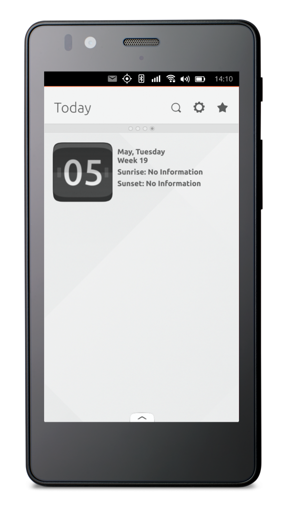
When no data feeds are connected to the scope, the scope will appear bare.
Settings
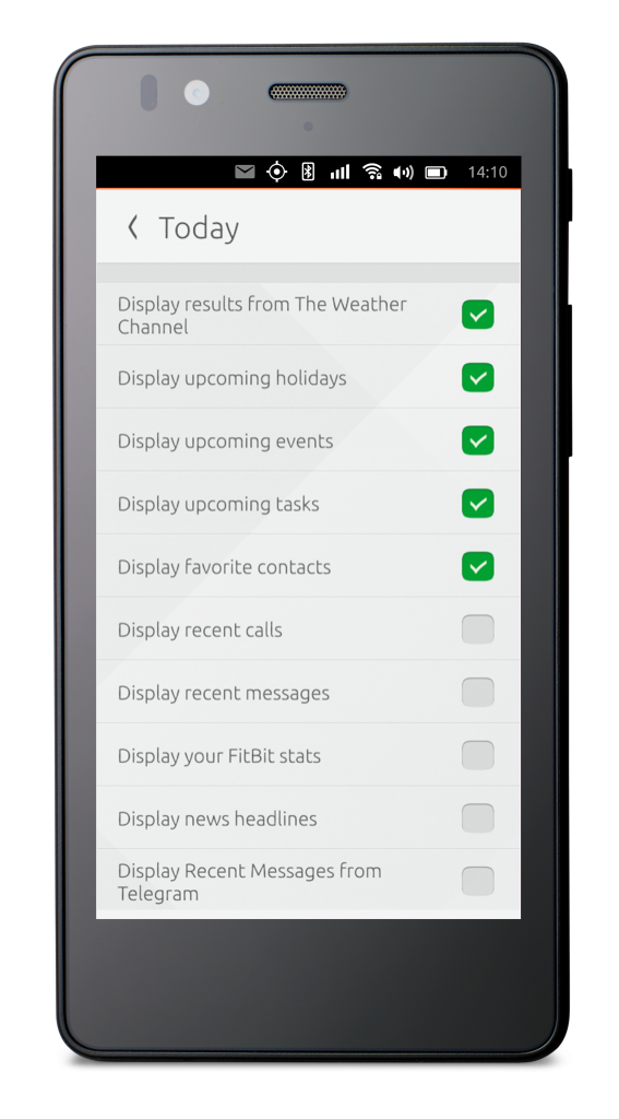
From the ‘Settings’ icon in the scope header, the user will be presented with a checklist with the data sources they wish the scope to be fed with.
Scope is fed
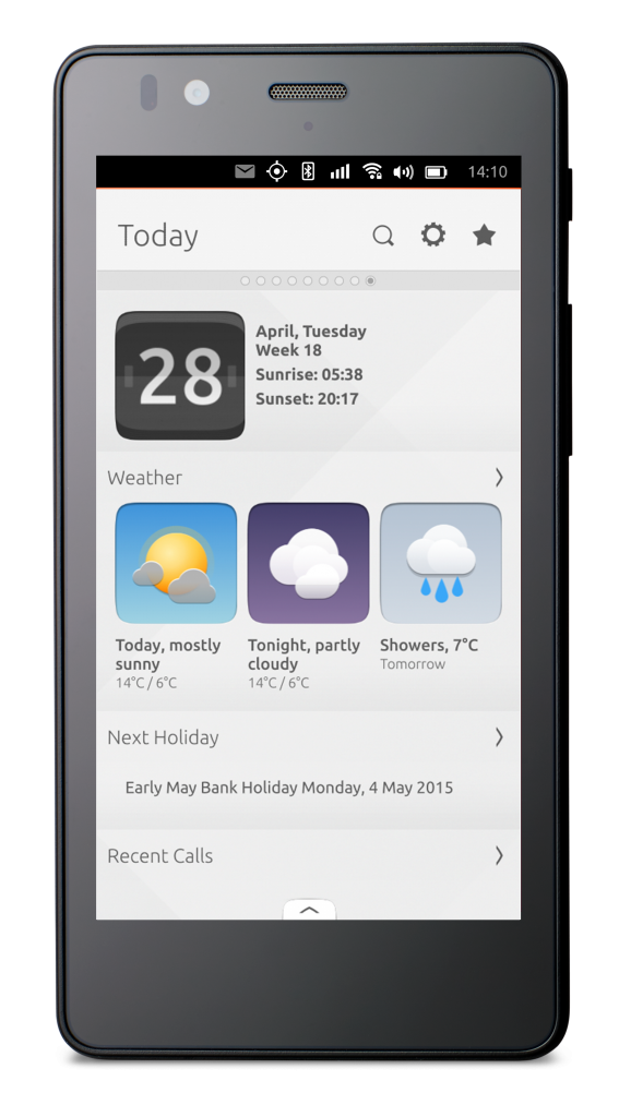
Once the user goes back to the scope screen, the scope will be automatically filled with the chosen data feeds.

The header must always have a back button to take the user back to the previous screen, if it is invoked by an aggregator scope or through settings.

See how to implement location settings inside your scope in our SDK.
Designing layouts
Scopes are made up of categories and cards that can be laid out in different ways.
Cards
Cards can contain up to three components that can be arranged in a variety of ways: in either a vertical or horizontal template.
-
Art
-
Header
-
Summary
Vertical cards
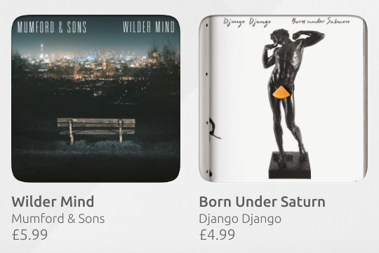
Taken from our Music scope, this card is used to display a track listing. Contains: Art, Header (title and subtitle) and Price (attribute).
Horizontal card
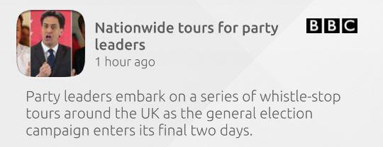
Taken from our News scope, this card is used to display a snippet of a news story. Contains: Header (mascot, title, emblem, subtitle) and emblem, Summary.

See more in our Components section on the different card sizes and layout designs.
Categories
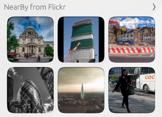
Choose to display your cards in a grid or horizontal-list layout.
Grid layout
This is an example of how you can use one component to display a result.
Horizontal-list layout
This is an example taken from our NearBy scope, where it shows events in the user’s local area using a header that overlays the art (image).

See more in our Components section on how to structure your categories and how both the category and scope header works.
Sourcing your scope
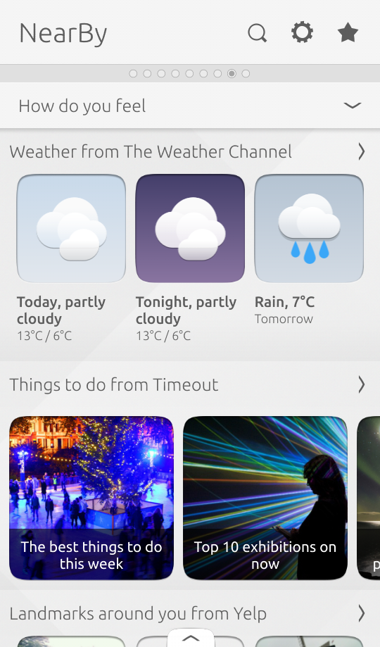
Scopes can be fed by a range of different content sources; a great example of this is the NearBy scope.
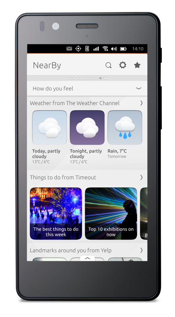
How do you feel?
-
Weather – from the Weather Channel
-
Things to do – from TimeOut
-
Landmarks – from Yelp
-
Photos taken around you – from Flickr
-
Interesting articles – from Wikipedia
-
Concerts nearby – from Songkick
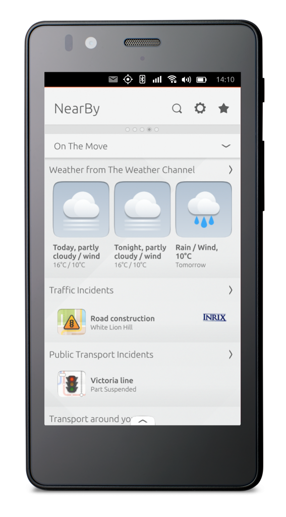
On the move
-
Weather – from the Weather Channel
-
Traffic alerts
-
Public transport alerts
-
Local taxis, tubes, bike hire, bus stops
-
Nearest parking
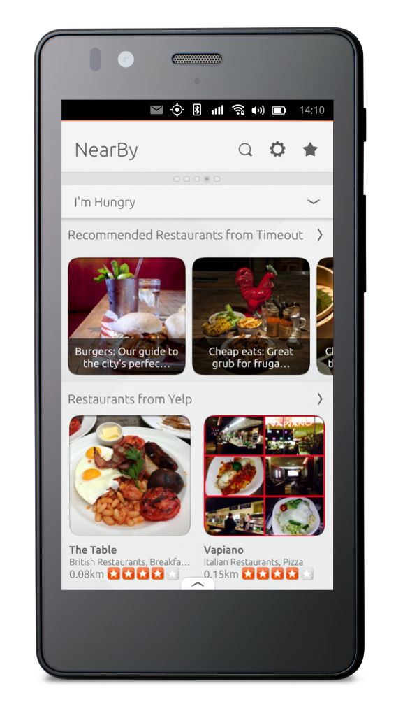
I’m hungry
-
Restaurants – from TimeOut
-
Local ATMs
Hidden gems
The NearBy scope draws in all manner of places, landmarks, and cool new bars that you may have never heard of.
Here are a few examples of some hidden gems that have been found using the NearBy scope.
 Ubuntu Phone documentation