Header
Use the header to let the user know where they are, what they can do, and where they can go inside your application.

 |
The Header API includes the exposed, flickable and moving properties of the header. |
|---|
Usage
The header area can contain the main navigation options and actions inside your app. It is used to enhance the user experience in specific device layouts.
When should I use a header?
-
If your app has multiple sections
-
If your app performs an action that requires the full screen, such as a camera, then don’t use a header.
Multiple panels may appear when the surface or window increases in size. When this happens, each panel can contain its own header. For example, on a mobile surface, one panel is present at a time as the pages are stacked on top of each other in a hierarchical order. However, when translated onto a medium to large surface the panels become adjacent to each other and will contain their own header, while still remaining in a hierarchical order.
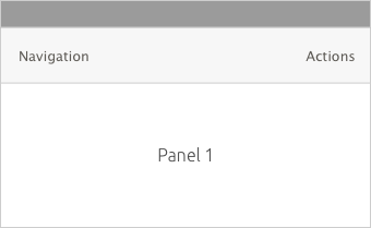

- Navigational options on the left
The navigation area can include a Back Button, title, a subtitle or a navigation drawer for when there is no room to fit all buttons for major views.
- Actions on the right
The action area can include actions such as settings, search, views, or an action drawer for when there’s no room to place further actions.
 |
Don’t use a navigation drawer and an action drawer at the same time, because users are unlikely to distinguish between them. |
|---|
Slots
The header contains a number of slots that can hold actions or navigational options. Depending on the surface or window size, additional slots can be added to show the actions otherwise hidden in drawers.
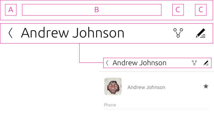
 |
Think about the most important actions and views you want the user to perform and make it easy for them to find by using the header. |
|---|
For smaller surfaces, such as on mobile, the SDK provides a maximum of four slots per header that can be arranged in two ways.
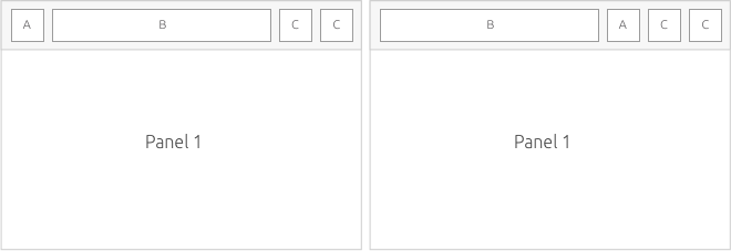
Slot arrangement
Slots can be arranged in a variety of ways to surface actions and navigational options to best suit the user experience of your application.
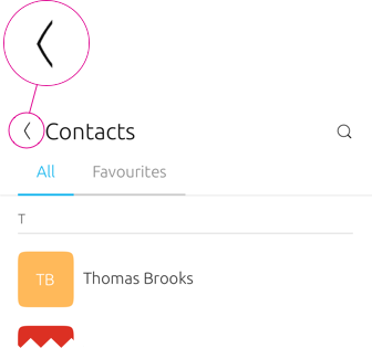
Slot A
-
First position on the left hand side
-
When slot A is not needed, slot B should move to this position
-
A navigation drawer can displays all main views in an application
Slot B
-
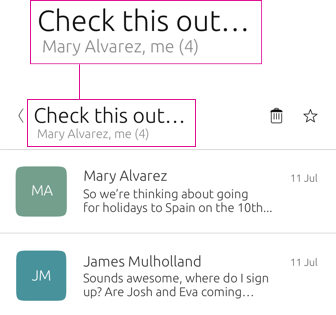
Mandatory title of your app or view, only one line
-
An optional subtitle can sit below the title, which can be two lines
Slot C
Slot C can have any action inside it, such as ‘Add new contact’ or a ‘Call’ action.
Search
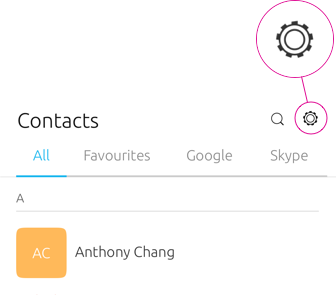
If you are using Slot C for Settings, then it should always be positioned last.
Settings
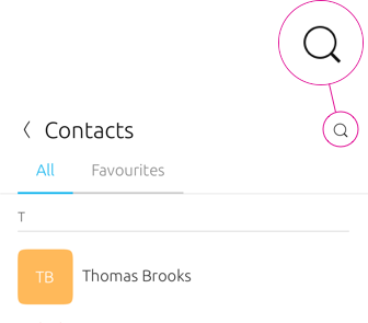
If you are using Slot C to place a Search icon, or any other action, then place it to the right of the title.
Action drawer
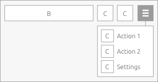
An action drawer can be used for when no other slots are available to show them. However, when your app is on a larger surface, like on a desktop, then actions will appear in the slots.
Responsive layout
As the header gains width across screen sizes, additional slots become visible and actions in the drawer will appear automatically.
3 slot layout

4 slot layout

5 slot layout

6 slot layout


Medium to large screens
The maximum number of visible action slots in a convergent environment is 6. If this is exceeded then additional actions will migrate to the action drawer.
 |
If your header has no more slots for actions, then everything after Slot D goes into Slot E inside an action drawer. |
|---|
Search inside the header
You can use search within the main header to filter the currently displayed content; or as a global search.

Multi-panel layout
Search can appear in both panels when two or more headers are present. For example, in a mail client you may want a filter for your inbox in the first panel, and a search in the second panel to find a recipient.
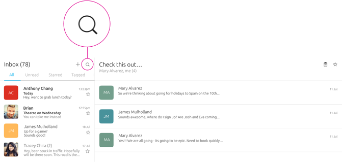
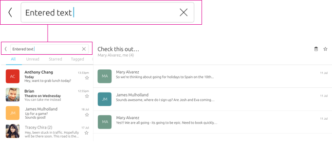
Avoid placing search in both panels unless necessary, because it could confuse the user as to what content is being filter. For example, they may type in the wrong field to search for a specific query if it isn’t in a hierarchical order.
 |
Find more information on search in the header see Navigation (coming soon). |
|---|
Toolbar
The toolbar is an additional component that can be used to hold actions.
 |
The Toolbar API allows you to determine the action or options you want to display in the toolbar. |
|---|
Edit mode
Edit mode allows users to modify a particular item or multiple items at once. To enter edit mode users can initiate it by directly interacting with a list item, title or card, or through an action inside the header.
When should I use edit mode?
Use a separate edit mode if making the information editable all the time would substantially interfere with viewing, copying, or other tasks. For example, in the Notes app, if a note were editable all the time then the OSK would take up valuable reading space, and hyperlinks in notes would be hard to click or tap.
A toolbar can be used below the header to provide additional actions associated with editing. When editing content the actions that appear inside the main header and toolbar are relevant to an edit state allowing the user to perform tasks on the content, such as: select, rearrange or delete.
Use cases
#Actions in the header ‐ picking and editing content
If a primary action of your app is to allow users to select and move content in a list, such as a list of contacts, then surface the editing action inside the main header.
Once the user has initiated the editing action, the toolbar will appear below the header with the associated editing actions for the content.
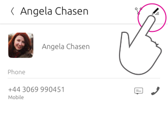
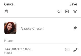
If you only use one text button then place it on the left hand side, because it will be easier for the user to reach with one gesture.
 |
The toolbar can contain additional actions other than editing ones, such as ‘Share’ or ‘Forward’. |
|---|
Edit mode in a multi-panel layout
Edit mode can be triggered through an action in the header or right-clicking or long-pressing the contextual menu.
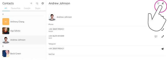
An activated edit mode must always apply to the panel view it is triggered in. It should not affect any other panels.
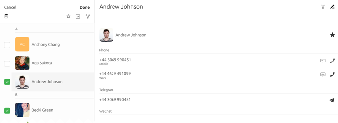
If you need a delete icon place it on the left of the toolbar. If the content you are editing needs to be saved then use two text buttons instead, such as ‘Cancel’ and ‘Save’.
 |
Place negative actions on the left and positive actions on the right in the main header for consistency across the platform. See Design values for more information. |
|---|
Toolbar placement
The toolbar appears below the main header when edit mode is initiated.

-
Main header
-
Toolbar
Header appearance
You can decide how you want the header to appear in four ways: Fixed, Fixed and Opaque, Fixed and Transparent and Hidden.
 |
When a header is displayed in a larger surface or a window, such as in a desktop, it will be fixed, because there will be more room to display content. |
|---|
Fixed (default)
A fixed header will appear at all times until the user starts to scroll down within your app’s content. Having a fixed header can be useful if you have a few sections or actions that need to be accessible even when the user scrolls. For instance, in a photo editing app the user may want the editing tools to be fixed in the header for easier access.
If your app displays a header section below the main header, then it will follow the defined behavior of the main header.
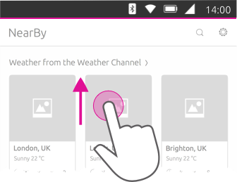
The header can be brought back into view by:
-
scrolling up on the content
-
tapping or interacting with the content.
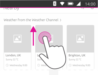
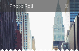
Fixed and transparent
The header will be available at all times and have a transparency of 80-90%. This type of header can be useful if you don’t want it to be the focus of attention, but still available if the user wishes to have quicker access to a view or action.
Multi-panel layout
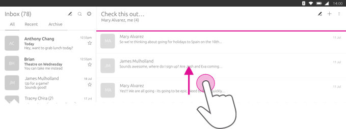
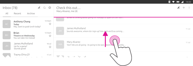
If your app is presented in a multi-panel layout, then the headers that appears in each panel will remain fixed and always visible when scrolling.
Overwritten fixed header
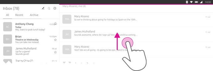
If you choose to overwrite the default header, then it should:
-
react with its associated panel
-
not affect other panels.

Hidden

Overlay

The header is not visible to the user. This type of header is useful for full-screen applications, such as the Camera app.
Useful in displaying more content in a single screen.
Apps without a header
If you choose not to have a header then think about how users will navigate through your UI in a different way.
Overview
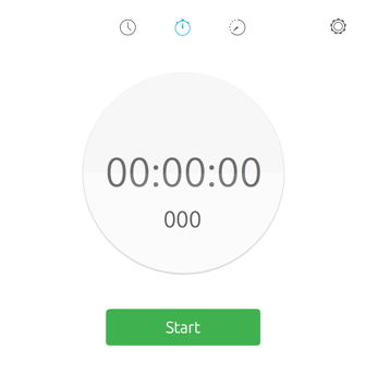
Top level
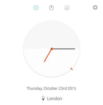
For example, the Clock app has a customized header and uses icons at the top of the screen to take the user to different modes of the app.
Header section
The header section allow users to easily shift between category views within the same page. It has the same visibility as the main header. For example, if the header is set to default it will slide away with the sections when the user scrolls down.
 |
The Section API displays a list of sections that the user can select. It is strongly recommended to limit the number of sections to two or three to avoid a cultured looking header. |
|---|
Dekko app
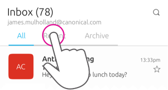
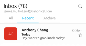
For example, if your app was presenting an inbox of emails, from ‘All’, the sub-sections could display ‘Recent’ and ‘Archive’ to further filter the content. More sections on the screen can be visible by swiping right.
When a mouse is attached
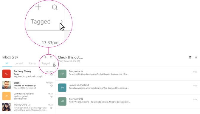
More tabs are indicated by an arrow revealed when the user interacts with the header section using a mouse.

-
The main header is a separate component that can hold actions and navigational options
-
The header section sits below the main header and allows for sub-navigation or filtering within the screen, which is indicated by the header above. One option is always selected
Best practices
Header section
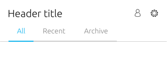

Do
Make your sections clear and concise.
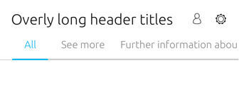

Don’t
The header section can look cluttered if you make the titles too big.
Actions
Allow users quick access to the most important actions by placing them inside the header. For example, in the Contact app: ‘Call’ and ‘Add Contact’ are available in the header to give quick access to the Dialler and Address book.

 Ubuntu Phone documentation